Email layout: basic rules for effective emailing
Email marketing is great, but only if all the details are well thought out. More often than not, marketers focus on the content, and as a result, the layout of the emails can suffer. At the same time, the quality of the delivery of the mailing depends on its quality – the number of emails sent to spam is reduced.
The layout also affects the way the reader perceives the information. If the user does not understand what to do next when briefly reviewing it, or which link to click, then you can consider that this lead is lost.
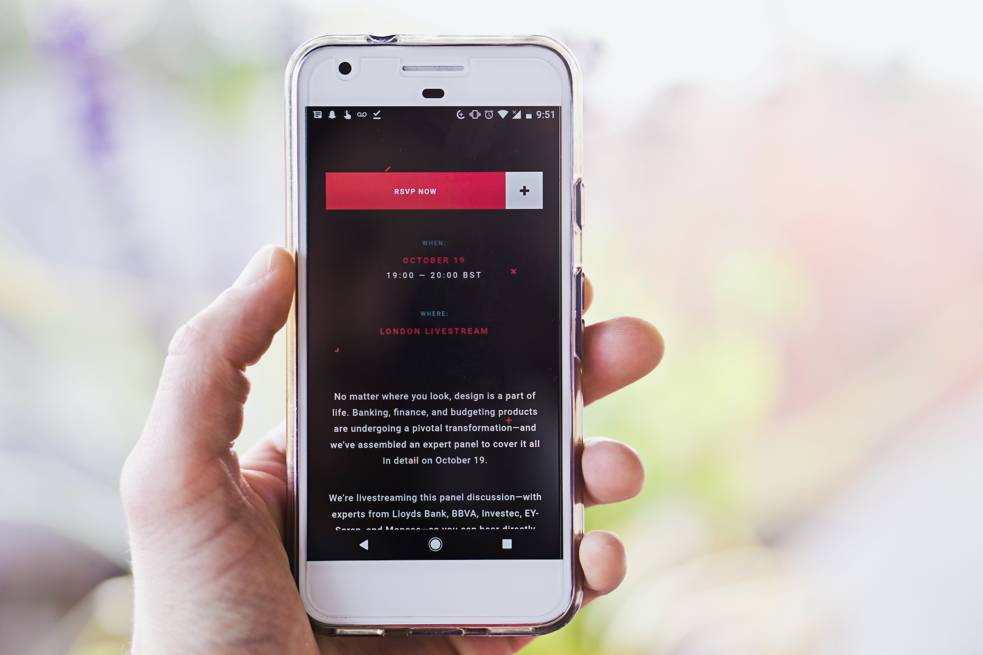
One common mistake is that email is not adapted for mobile devices. Despite the increase in mobile devices, companies often forget to make their mailings readable from smartphones. According to studies, more than 50 percent of potential customers are lost without adapting the emails. It’s important that newsletter content is easy to read from a variety of devices – both smartphones and PCs. Adaptation includes placing all the elements in one column, in addition, information that does not make sense should be removed. In this way, the content of the letter is easier to understand, and it will be easy to read from a cell phone.

The second point you should pay attention to when composing your mailing list is a well-designed email structure. It should be the same for all the letters, which makes it easier for the user to get acquainted with the content and makes it easier to immerse themselves in the text. It is better to give information concisely and gradually, starting with what the company offers. Next, you should go into details of discounts, promotions, and other information that should interest the user. Button to contact, contact information is recommended to place in a prominent place, so a person does not waste time looking for them. An excellent solution would be a template layout with a header and footer of the email, which will contain data about the company.
It’s important not to overdo the visuals in your letters. Images should be used to supplement the text, not play the main role. Besides, they can affect the loading speed of the email, and the user will close it before it has loaded all the images. One more disadvantage of such elements – if there are a lot of them, they cannot be properly adapted for different mobile devices.
When composing an email newsletter, you need to pay attention to the peculiarities of email systems. They may take into account some elements and not recognize others, and all these points should be taken into account in the layout. For example, the popular Gmail service doesn’t fully load emails larger than 102 Kb. The service hides part of the content, which reduces the effectiveness of such promotion. Therefore, it is not necessary to make emails too massive and overloaded.
