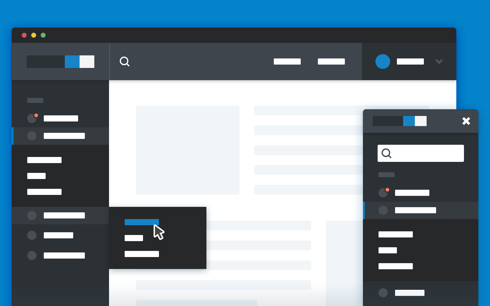
How to choose a website menu: an overview of options
The website menu is the first thing a new visitor to a resource looks for. It should give the user answers to the questions they are interested in, where to find this or that product, and what else interests them on the portal. The menu must be clear and easy to use. Otherwise, the visitor will not be able to understand the navigation and will simply leave the site.
Types of website menus
The developers use different types of menus to make it easier to get familiar with the resource, including:
– static menu located at the top of the page;
– fixed option;
– a combination of fixed and static menus;
– multi-level type;
– burger.

Each of the listed types is suitable for specific web pages. For example, a static menu allows users to find the section they want from the list at the top of the page. However, this type is only helpful if there are not many elements on the page and the content can appear on the first screen without the need for scrolling.
The fixed menu will remain in one place even after scrolling the page. At the same time, it should not prevent the user from reading the content and should not interfere with the usability.
A combination of the first and second types of menus is often common for online shops. Visually, it is similar to a static list but has more items. At the same time, when the user scrolls down the page, a short menu appears with a few essential items, such as contacts and a shopping basket.
A multi-level menu initially contains a variant with a few items, but when the user clicks on it, the expanded variant with all the sections appears. In this case, it is important not to overload the page and to consider the number of initial items.
The burger menu is often an alternative to the static type. It looks like three bars that expand into a list when clicked. Initially developed for the mobile version of the site, it is now also available for standard resources.
Website menu and its importance
The choice of menu type should depend on the size and focus of the resource. A burger and a combination of static and fixed menus will work well for large online stores, but a multi-level variant is more appropriate for small sites and services.
Among other things, the menu is a great way to increase conversions:
– a well-designed navigation allows the user to quickly understand what the site offers and what it is about;
– the resource looks better organised and clearer;
– convenient navigation encourages the user to stay on the site as long as possible and to browse new pages.
When designing the menu, you should focus on its maximum usefulness to the visitor. It should give the user all the necessary information about the categories and structure of the site. The menu should not be overloaded with numerous sub-items.
